Quantcast
Channel: Camera Ergonomics
Viewing all 824 articles
Browse latest View live

Canon G1X Mark II, Thoughts about the concept

$
0
0

Sydney, Circular Quay, early evening.


Engineering triumph or missed opportunity ?


One of Photography's Really Good Ideas:   Consider the following:
1. According to data from camera makers, occasionally revealed by one or other photo commentator, the average number of lenses purchased for each  DSLR is 1.4 and for each MILC 1.3.  A few buyers purchase many lenses which means the majority buy their camera with a kit zoom and never remove it. This majority is not utilising the benefits of an interchangeable lens system. This substantial number of users would be better served by a camera with fixed, built in zoom lens IF  that option delivered tangible benefits such as greater zoom range, larger lens aperture, smaller size or lower price.
2. Without the impediment of a lens mount between the lens and body, a fixed, built in zoom lenses can collapse back into the body of the camera. With good design this could possibly  enable any or all four of the benefits cited above.  
This is the  really good idea.  A fully featured camera with picture quality,  performance  and ergonomics equal to a DSLR or MILC but in a smaller package offering a better  (greater zoom range, wider aperture, smaller size)  lens than your average kit zoom.  This camera would have a fully auto mode  suitable for novices but would also have the performance to appeal to expert and professional users.
If this concept camera can be built and really is such a good idea where are all the models built to this specification ?  They are distinguished only by their almost complete absence.
Olympus has the Stylus 1 which appears to be headed in the direction which I suggest but it's small sensor means picture quality is not in DSLR/MILC territory.
Maybe designing and building the lens is more difficult than one might imagine. Maybe the manufacturers don't want to take sales away from their own ILC's.
Photo courtesy of imaging-resource.com
G1X top view
 
Canon's interpretation, the G1X   The first version of this model was announced in January 2012.   Canon's promotional literature at the time touted  the G1X as  "creating a prestigious new category".....  it was....  "the finest compact Canon has ever produced" ....."revolutionary"....."designed to produce DSLR levels of image quality and performance in a highly portable metal body"...... "the perfect  complement to a Professional DSLR"..... and on and on for several pages of  extravagant  prose. 
It all sounded pretty good so our family bought one. OOPS !   Big mistake.   After all the hype, the reality was  extremely disappointing.  All aspects of operation were frustratingly sluggish including autofocus, shot to shot times and all adjustments.  Close ups were not possible. The optical viewfinder was a carry over from many previous G cameras. It revealed only about 60% of the area of the actual captured picture, had parallax error and provided no camera data at all. There were ergonomic issues. The front control dial was inaccessible without completely changing grip with the right hand.  The picture quality was OK but nothing special.  Highlight clipping of JPG's was common.  The lens was decently sharp but slow of aperture and slow in operation. The video button often got pressed accidentally.  I wrote a review of the camera for this blog but found myself unable to identify more than one  positive thing to say and never published it.
The G12 also in the house at the time was a more user friendly device.
Canon's material  read  as though they were trying to implement a realisation of my really good idea  but somewhere along the way they lost the plot and produced a half baked disappointment instead.  My list of improvements which I wanted to see in any follow up model  included  almost everything.
The G1X DXO Mark score was 60 which is reasonable but several cameras with smaller sensors scored higher. The thing desperately needed a good EVF, improved operating speed, a lens with wider aperture, faster operation and closer focus, a more ergonomic handle, better control layout  and better ergonomics. The one thing the G1X did get right was the fully articulated monitor.
Now the G1X (II)  It seems Canon is having another try at the same concept. Again there is a wealth of promotional literature, this time in the form of an  illustrated brochure entitled  "Story of the PowerShot GX1 Mark II Development" This time the promotional material  talks about  the  creative efforts of the "large team" at Canon headquarters to solve various technical problems. Apparently putting two dials on the lens and making one of them clicky and the other one smooth was one of those problems.
The brochure  says that ..."unrivalled technology was used to create the new flagship model"....... Since the erstwhile flagship model sank even before encountering rough seas, let's follow the brochure further........."with the birth of the Powershot G1X MarkII, Canon's philosophy and technology are embodied in one camera".....
....."Photographers and survey results from users provided a vast amount of feedback and Canon's engineers improved everything they could".....There is a lot of explanation and praise for the engineers on the subject of the lens the sum of which appears to be that they increased the zoom range (both wider and longer), increased the aperture by about 1 stop (a bit more at the long end) across the range and got it to focus both closer and faster.  All this sounds very good and just what the customers ordered.
The brochure then goes on ...."Canon's  R&D team was particularly conscious of the camera's viewfinder operation".... ..."the optical viewfinder does not necessarily lead to great viewer satisfaction. The EVF was introduced to solve this: it offers 100% coverage and it can display a variety of shooting information"   All this might be true if the camera actually had a viewfinder. They got rid of the totally inadequate old OVF from the G series and replaced it with...........nothing.  For a team "particularly conscious of the.....viewfinder operation.."this seems like an extraordinary decision.  Now you have to buy a large, expensive accessory item if you want a viewfinder.  With the EVF mounted the camera's height is 114mm which is greater than most mid level DSLR's.   Compact ???
Now the brochure moves on to the control rings around the lens. The original G1X had a control dial in front of and below the shutter button. This was poorly positioned and difficult to operate with the right index finger. The course of action which seems most ergonomically logical to me would have been to raise and deepen the handle, put the shutter button front left on the handle  and a control dial just behind the shutter button,  Canon DSLR style. Canon has been doing layouts this way for years, why not continue the same theme on the G1X ??  Maybe because it's "DSLR Style" not "Compact Style"  I don't know.   What actually happened is they removed the control dial altogether. So now they had to find some place for a replacement and selected the lens barrel. Why the lens barrel ? Maybe because they reduced the size of the right side of the camera and handle so much there was no place else for it to go.  The brochure says    "With composing the image through the EVF in mind, it is easier to shoot if the controls are around the lens"   My comment on this:
a) the camera actually doesn't have an EVF and
b) who says it is easier to shoot if controls are centered around the lens ?  My ergonomic studies would preference using a well positioned control dial just behind a forward located shutter button, just like a Canon DSLR.  Presumably Canon doesn't believe it's DSLR's are difficult to use.
The brochure then spends several pages detailing the development of the lens and image processor which all sounds fine and perhaps an opportunity for the engineers to come out from the back rooms for a moment of recognition.
There is reference to  the multi aspect ratio sensor which is an excellent idea and one I appreciated on my Panasonic GH2  several years ago, but why did they not include 16:9 ratio ?
The brochure concludes with reference to ergonomics  ....."Ergonomically strong emphasis is placed on handling and in particular the operation and material quality of the dual control rings"  We are back on the clicky and smoothy rings again  which appear to have provided great exercise for the design team.  
Unfortunately, on the subject of ergonomics, they forgot the handle. Well, they included just a flat little quasi handle. If you want a handle which provides actual grip you have to buy it separately (in some markets but apparently it's included in other markets, go figure).  Why don't they just put a proper handle on the thing and stop messing around ?  It would not add any depth which is already determined by the lens.  If properly designed it would make the camera much easier to hold and operate.  Olympus is another maker which does this silly dance with the handles.  They  make some cameras (for instance EM5, EM10 but not EM1 which they got right, go figure)  with the shutter button  in the rearward position on top of the body  (instead of the more ergonomically logical position  on the handle)  then deprive the body of a proper handle but offer one as an accessory.  When the accessory handle is fitted the right index finger and third finger are pulled apart as the third finger tries to go forward on the handle and the index finger tries to go back onto the shutter button.  I do keep going on about this  and the reason is the camera maker's (several of them) persistent use of sub optimal ergonomic layouts.
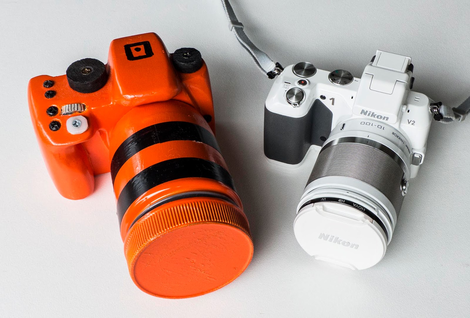
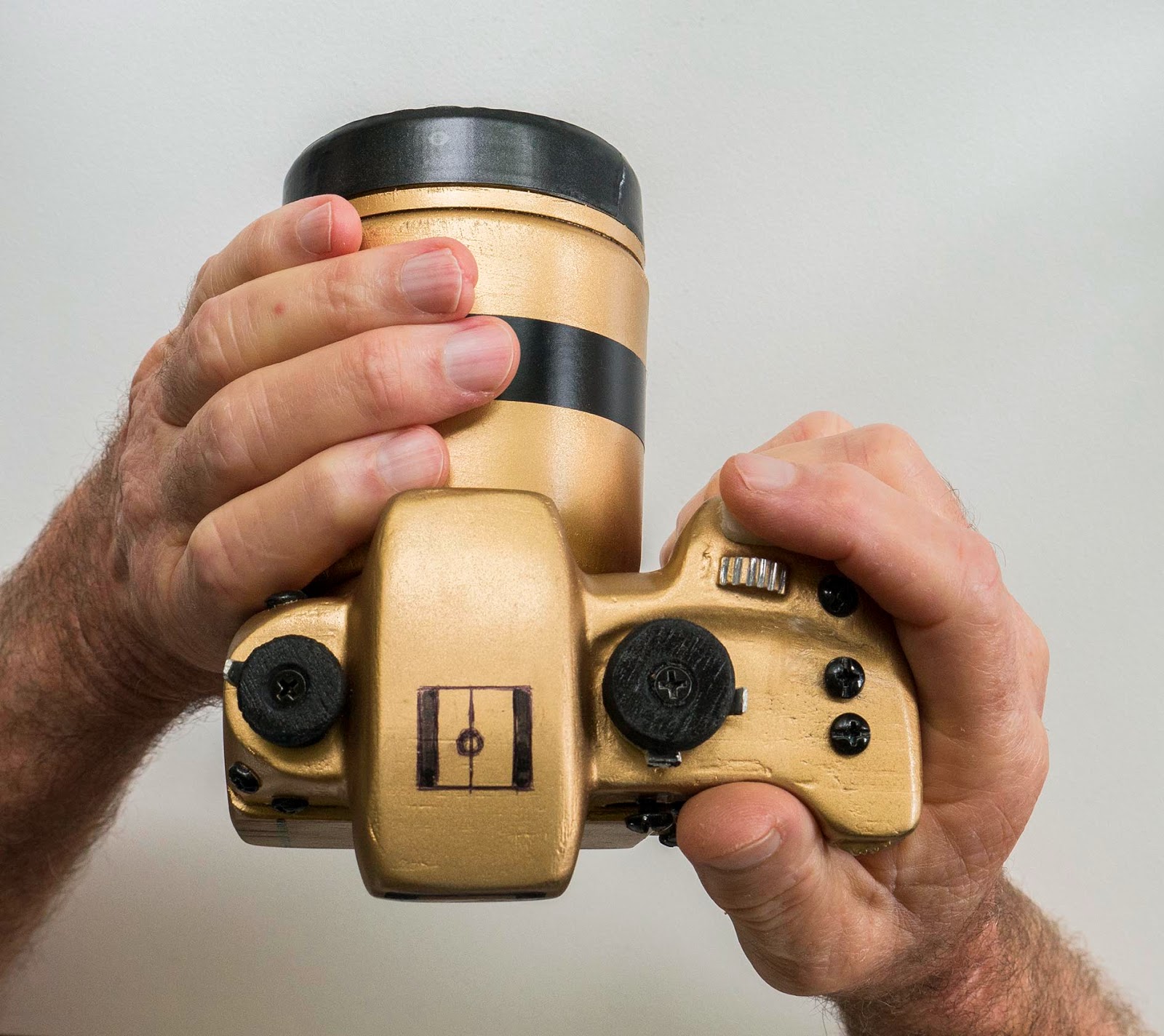
The mockup referred to in the text below.  The design is such that anyone from men with large hands, women with long fingernails to children from age around 10 can hold and operate it comfortably. With a lens having the specifications of that in the G1X a camera like this could appeal to a wide spectrum of users.


Camera design as football     It looks to me as though Canon has brought the ball to the half way line, sent the entire "large (engineering) team" out to lunch and brought on the marketing team. 
Camera design as camera design   The original G1X  was a depressingly half baked device. The only thing I felt positive about was the fully articulated monitor.  The Mark II version needed and got a complete re design. Unfortunately they stopped half way through the process and to make matters worse downgraded  the fully articulated monitor to the less versatile  flip up/down type. There is no built in EVF, no built in handle and there is insufficient space on the right side of the body for a comprehensive suite of controls to suit  the camera's target, expert/enthusiast user group.
I think they half baked it. Again.
It appears the Mark II  has landed uncomfortably in the same no man's land as the original. It is not really compact in the sense that the Sony RX100 is compact. But neither does the whole camera fully exploit the potential benefits of the lens (assuming the lens is as good as it's maker claims). Without the EVF viewing will be unsatisfactory in sunny conditions. I have never yet encountered a camera with a monitor capable of  providing a clear view on a sunny day in Sydney. With the EVF it will be as expensive as and taller than a DSLR. In any configuration it will not be as comfortable in use as a camera with a well designed ergonomic handle. 
Another way  I would like to see the G1X cameras grow up a bit in size and a lot in usability. The orange mockup shown in the photo is 3mm wider, 6mm taller (but with a built in EVF) and the same depth from the monitor to the front of the lens. The EVF eyepiece protrudes back another 6mm. The lens shown on the mockup has a diameter of 55mm, that on the G1X is 65mm in diameter. There is plenty of space on the front of the mockup for the larger diameter lens. Although slightly larger than the G1X(II) without EVF the mockup fits my criteria for a Proper Camera.  It has a fully anatomical ergonomic handle, comfortable thumb support, forward shutter button and control dial, built in EVF, fully articulated monitor and a full suite of controls for expert use.
I do not understand why Canon has not configured the G1X  like the mockup.  Although it would be about the same size as a small MILC with kit lens, no existing ILC kit lens has the combination of 5x zoom range, wide aperture and compact dimensions found in the G1X.  The approximately comparable EF-S 15-85mm lens for Canon DSLRs with 28mm diagonal sensor is a much larger, heavier, expensive lens and still only manages an aperture range of f3.5-5.6.
Maybe Canon does not want to compete with it's own DSLR's.  The problem is that the G1X (II) might not compete with anything.  There are plenty of  compact Micro Four Thirds cameras out there many of which perform very well with a kit zoom and make a more compelling case for the expert user.  Maybe Canon has gotten hung up on the "compact" concept and a set of design conventions  (habits ?)  which traditionally express the compact camera genre.
I think there is a large market segment out there which is Canon's for the taking but might be grabbed  by another  maker while Canon is slowly half cooking the G1X.


Nikon 1 V3, Where is Nikon going with the 1 series ?

$
0
0

Nikon 1 V3
Photo courtesy of Digital Photography Review dpreview.com
Where is Nikon Going with the 1 System ?


Background  Last year our household acquired a Nikon 1 V2 camera with 10-100mm zoom lens. It has proven useful in a wide variety of situations. It caught the eye of two other family members, both ladies, who also bought the V2 with 10-100mm lens. One wanted to photograph her children at play and sport, the other wanted to capture photos of nature and wildlife. My wife is the main user in our household. She uses the V2 for general photography and tried it for photographing birds.
Long lens rumors  But the 100mm focal length is not long enough for most birds. So she was very interested when rumors began to surface of a new 70-300mm lens for the Nikon 1 system. At the long end this lens provides a diagonal angle of view of only 3.4 degrees. This is ultra telephoto territory.
The lens is real  In due course the rumors were found to be true and the 70-300mm lens was announced.  Although the aperture range is a modest f4.5-5.6 this allows the lens to be remarkably small. It is only 108mm long when collapsed for carrying. In one product  Nikon  democratised the super telephoto zoom lens and began to realise the benefits of the small, 15.9mm diagonal sensor in the 1 series. If this lens has good optical properties and very good VR (it will need to be good) it will make sport, action, wildlife and bird photography accessible to thousands of photographers who could never afford an 800mm lens for a full frame camera. Bravo Nikon.  
Nikon 1 V3 with accessory EVF and handle.
Photo courtesy of Digital Photography Review   dpreview.com


Now for the camera  An ultra telephoto lens is not the easiest thing to use so the 70-300mm will need a suitable camera behind it. My wish list for improvements I wanted  Nikon to make in updating the V2 to the V3 include:  A larger, more ergonomic handle for secure grip, a larger, better quality EVF and a more enthusiast/expert oriented user interface. A bit more dynamic range and a bit less high ISO noise would have been welcome.  The orange mockup shown in the photos represents my vision of the design direction in which I would like to see the Nikon V cameras go. The one thing I did not wish for was more pixels. At 14 Mpx the V2 has plenty.
So, what did we get ?    The V3 has more pixels.   And it  costs more.  A lot more if you want the handle and EVF.  There is no doubt in my mind that if you want to use the long lens you will very definitely need the handle and EVF.
And what did we lose ?  They removed the handle. Oh, they left a little bump where the handle used to be.  But the bump will be of little use with a long lens mounted.  I notice that compared with the V2,  they also moved the lens axis to the right (as viewed by the user) making it difficult to fit a decent handle anyway. The accessory unit sits offset to the right when mounted.  And they removed the EVF.   And they fitted a smaller, less powerful battery. The V2 uses the EL21 with 1485 mAh. The V3 uses the EL20 with 1020 mAh. And they changed the memory card from standard SD format to the Micro SD format. What was that about ? It's a camera not a smart phone. There is plenty of space for a standard SD card.
What on earth were they thinking ?   I understand that there is a place at the entry/budget end of  the market for little cameras without handle or built in EVF.  There are several of these in Nikon's 1 series lineup already.   But the V  is the premium model in the lineup.  Done right I think the V3 could appeal to a large cohort of enthusiast users who would welcome the opportunity to benefit from the high speed technology inside the V cameras and the ultra telephoto lens possibilities opened up by the 70-300mm.
My thoughts on the V3   This looks like a camera which doesn't know what it wants to be. In my view it needs to be a fully featured mini DSLR style model with all the features and capabilities of a mid range enthusiast DSLR/MILC but in a smaller size. This is entirely possible as the V2 and my mockup demonstrate.  The V3 makes no sense to me at all.  When optioned up with the handle and EVF it is way too expensive. Even then the package is not appealing. The slip on EVF will be vulnerable to damage if left on the camera and a perpetual nuisance if carried off the camera. The accessory handle if fitted duplicates the shutter button, wasting valuable camera top real estate and sets up a confusing and ergonomically suboptimal configuration of front command dials.


On the left my mockup with ye olde peanut butter jar lens which by coincidence happens to be almost exactly the same size as the new Nikon 1 series 70-300mm lens. On the right a V2 with 10-100mm lens. 
Notes on the mockup  The orange mockup embodies my ideas for  the ideal small yet fully featured camera suitable for beginner or expert/enthusiast users.  It is the same height as a V2, 11mm wider and  16mm deeper although  a lens if mounted  determines total depth.  Something very close to this would describe the camera which I wanted the V3 to be. It has a fully anatomical handle and thumb support, forward shutter button with quad control layout including command dial, fully articulated monitor and a full suite of hard interface modules for hands on control of the device.


Rear view of the mockup beside the V2. They are actually the same height although the angle of view here makes the mockup seem taller. The mockup is much nicer to hold. It doesn't need to be orange, I just wanted you to notice it. It actually started life painted mid gray, but that was too dull and boring.


What about the 1 series ?   At this point neither my wife nor I know what to think about the Nikon 1 series. We could keep the V2 and mount the new 70-300mm lens and we might do that.  The problem is that we have no confidence in the direction (or lack of direction) which Nikon appears to be taking with it's 1 series. Why is the V3 not a full featured all inclusive unit ?  Why is Nikon  dithering about with accessory EVF and handle on it's top model ?  We want to feel some confidence that we know and Nikon knows,  where it is going with the 1 series so we can get on board with the system or drop it and go elsewhere.  
Is Nikon deliberately overpricing and  underspecifying it's V series to protect DSLR sales ?  Are these inexplicable (to me) changes moved by styling considerations ?  I am confused.
It defies logic that a camera maker would go to all the effort and expense of  developing  a new line of cameras then deliberately disadvantage  those cameras in the marketplace. My personal view is that the 1 series has great  potential which Nikon is not fully exploiting with it's product lineup. 
In the meantime..............  We have been using a Panasonic FZ200 which has a superzoom lens with a diagonal angle of view at the long end of only 4.1 degrees, almost as narrow as the 70-300mm. The FZ200 also knows what kind of camera it is trying to be (do everything) and it half succeeds (or half fails depending on whether you are an optimist or pessimist)  falling short on several  key image quality and performance metrics.


We shall see......................

Using mockups to explore camera ergonomic design

$
0
0

Mockups 2014. I will discuss these in detail in subsequent posts. Older models towards the rear, most recent versions at the front.
 
A brief personal history

 
Background I have been using cameras for 60 years. The first was my father's Baldafix folding medium format rollfilm model which I was allowed to borrow sometimes when I was 10 years old. Since then I have owned and used almost every kind of camera ever invented. I became interested in ergonomics around 2009. I bought a Panasonic G1, the very first mirrorless interchangeable lens camera [MILC], after having used Canon SLR's and DSLR's since 1990. I could see that mirrorless was the future for interchangeable lens cameras but there were several problems with the G1's user interface (and image quality and performance, but this blog is mostly about the ergonomic issues). The G1 had the appearance of a scaled down L1, a 4/3 format DSLR. I realised that cameras are not scalable for the rather obvious reason that the hands which operate them stubbornly remain the same size no matter how large or small the camera might be.
I bought a Samsung NX10 which was the same size as the G1 but was much nicer to hold and operate. I realised that the problems with the G1 were not caused by it's small size relative to DSLR's but were due to design issues.

To investigate the nature of these problems I began making mockups.

The mockups I made these from scrap plywood lying about in my garage. I did complete cameras and also basic handle modules. I had very few preconceived ideas about the proper shape of a camera. The benefit of mockups is that nothing is disallowed, anything can be tried. I dreamed up and experimented with several avant garde shapes but none of these made it to completion, for the reason that none of them was practical. My most recent designs look very ordinary with hump top and handle like a small DSLR. I arrived at this shape because it works well ergonomically. The difference between my mockups and most actual cameras lies in the detailed realisation of the concept.

I now have 5 handle modules, 8 lenses (mostly peanut butter jars in various sizes) and 9 camera bodies. I also made a mockup of the Sigma dp2 Quattro just to discover for myself how one might hold and operate this odd looking device.

Ergonomics and camera makers I like to understand cameras in terms of product development, picture quality, performance and ergonomics. My impression is that camera makers are good at dealing with problems which are conceptually straightforward but technically difficult, such as picture quality and performance. But they often flounder when attempting to deal with problems which are conceptually difficult even though solving these problems may pose few technical problems. In this category I would put product development and ergonomics.

Ergonomics and camera users I am constantly surprised by the extent to which users appear to tolerate suboptimal or sometimes frankly dreadful ergonomics in their cameras. There are many well established metrics by which technical image quality and performance of cameras can be described and compared. But there is a paucity of words and taxonomy with which to describe ergonomics. So we read inane comments in camera reviews like "it feels good in the hand". I think that we are unable to describe, think about, discuss or analyse any subject such as camera ergonomics until we have the words and taxonomy with which to do so. Hence this blog which is one user's attempt to rectify the deficiency.

Next, Basic design decisions

Ergonomic Camera Design: The problem with likes

$
0
0
 
When I started to explore ergonomic design in cameras I somewhat naively imagined that a useful way to evaluate a camera would be to hand it to some people, ask them to hold and operate it then seek their feedback. This seemed like a perfectly logical course of action.

In due course I discovered that logical it might be but useful it is not. Why ?

The problem lies in the nature of individual likes, wants and preferences.

These have five characteristics which severely limit their usefulness to a designer.

1. They are idiosyncratic. In other words they are particular to that individual and reflect that person's experience and predispositions, whatever they may be. For instance when Panasonic released the GH3 there was a storm of adverse comment about it from contributors to user forums and some bloggers. It was "too big", "too heavy", it "lacked a soul" (whatever that means) and so forth. Some people were presumably expecting something different and the GH3 may have taken them by surprise. I have one and find it to have the best ergonomics of any camera I have used in 60 years.

2. They are transient. People's likes change with experience. That which a person likes today may be out of favour next month when something potentially more appealing is discovered.

3. They are often unformulated. By this I mean that a person may say they really like or dislike some thing or person or movie or whatever but have difficulty putting the reason into words.

4. They usually do not represent the outcome of a systematic evaluation, rather a snap judgement.

5. They are essentially retrospective in nature. They reflect the present state of a person's experience, which by definition is in the past. Thus they are not very useful as an aid to planning new ideas for the future. They may have something to say about the value of old ideas however. Henry Ford is reputed to have said "If I had asked people what they wanted they would have said faster horses".

So I stopped asking people for their opinions about various cameras' holding, viewing and operating characteristics, because the answers I was getting were entirely unhelpful to the ergonomic design process.

I realised that I would have to proceed by developing an understanding of camera ergonomics based on human functional anatomy and physiology. I would have to develop a language and taxonomy so the subject could be clearly identified, discussed and analysed.

Language and Taxonomy of Camera Ergonomics

$
0
0
 
Many cameras these days have good enough picture quality and performance for the majority of users and uses. The principal characteristic by which cameras can be distinguished from each other is ergonomics, including basic design characteristics, the user interface and user experience.

The three main descriptors of a camera are image quality, performance and ergonomics. There are many well known metrics by which image quality and performance can be measured, compared and discussed. But ergonomics lacks a system of widely understood, measurable descriptors, language and taxonomy (an organised method of classification). In consequence camera users and reviewers have difficulty talking or writing about ergonomics. If you can't name the thing you can't talk about it. If you can't measure something it is difficult to compare it with another thing.

If most modern cameras had excellent ergonomics this would not be a problem. But every camera I have used and/ or tested in the last five years could benefit from better ergonomic design. The worst are absolutely disgraceful but even the best could be improved with some attention to detail.


Taxonomy of camera ergonomics
The following description applies to a fully featured proper camera, not a low spec beginner's model. My concept of a Proper Camera requires an inbuilt electronic viewfinder, a full anatomical handle, a fully articulated monitor and a full suite of external controls for the expert/enthusiast user. Novices can leave Menus and Function buttons at default settings, turn the Main Mode Dial to the novice's fully automatic setting and use the camera as a point and shoot.

* There are four Phases of camera use, Setup, Prepare, Capture and Review.

* There are three engagement modalities, Holding, Viewing and Operating.

* There is a Task List applicable to each Phase of use.

* Completion of each Task requires one or more Actions. Actions can be counted and also evaluated for complexity.

Each Phase generates a different task list and utilises different aspects of the user interface. The task lists which follow are for basic still photo camera operation. I have not considered the requirements of video, off camera/multiple flash, time lapse and numerous specialised functions. I have also written the task lists for a mirrorless camera, with fixed or interchangeable lens. The lists are essentially the same for a DSLR but the optical viewfinder (OVF) replaces the electronic viewfinder (EVF).

Setup This is the Phase prior to setting forth to make photos. It is negotiated at leisure, probably with the Instruction Manual to hand. Typical tasks of Setup Phase include

* Make Main Menu selections.

* Allocate My Menu selections if available.

* Allocate Quick Menu items if available.

* Select Function button assignments if available.

* Select dial operation/function.

* Setup Wi-Fi and other special functions as available.

* Setup Custom Modes if available.

Some modern cameras have nice, straightforward menus which are logical and easy to negotiate. Others are frustratingly obtuse and convoluted. Some cameras allow a high degree of user configuration. This is a wonderful thing as it allows the user to effectively build his or her own user interface but novices might find the learning curve rather steep.

Prepare This Phase occurs in the few minutes before staring to make photos. Several types of user interface work well in this Phase. These include set and see dials (where you make and can see a setting on the dial), Quick Menu items and Function Button items. In each case you typically have the camera held away from the eye and are able to see dials, press buttons and scroll wheels by sight with selections and settings appearing on the monitor screen. With a modern camera using Mode Dial and Control Dial(s) layout typical tasks of this Phase are:

* Set Mode Dial to Auto, P, A, S, M, C or whatever is available.

* Set the most frequently used Modes. These would usually be Focus Mode (For instance AFS/AFC/MF) , Autofocus Mode (For instance Face detection, AF Tracking, 23- Area, 1-Area, Pinpoint) and Drive Mode (For instance Single shot, Continuous shooting, exposure Bracketing, Timer Delay). Ideally these frequently accessed Modes will be located on set and see dials/modules. This is the most efficient use of such dials or similar modules as it relates to items which you do need to adjust in Prepare Phase but do not need to adjust in Capture Phase.

* Set less frequently used Modes and other adjustments. These might include Flash Mode, Metering Mode, Recording Quality, Image Size, ISO (if it is desired to set this in Prepare Phase), Shutter type, Image stabiliser, Display, Burst/continuous rate, Electronic level, histogram.....etc....etc.   modern cameras are loaded with such items. These are best located on a programmable Quick Menu and/or programmable Function buttons.

Capture Now you are in the process of making photos. This phase imposes the highest ergonomic demand on camera and user as all adjustable parameters must be visible at a glance while using the viewfinder and quickly adjustable without having to shift grip with either hand. Tasks of this phase are:

Holding Hold the camera in a relaxed but secure grip with both hands. Maintain this grip while making the adjustments below.

Viewing Easily view in the EVF (or monitor)

*Subject preview (live view)

* Primary Camera data, ideally on a black strip beneath the subject preview (not superimposed over the preview image) in either landscape or portrait orientation. This typically would consist of Aperture, Shutter Speed, ISO, Exposure Compensation, White Balance, Battery Status, Capture Mode in use, Remaining exposure on card.

* Secondary camera data, superimposed over the preview image. This would usually consist of active AF area position and size, Grid lines, histogram, manual focus guide indications and others as available and/or desired.

Operating While continuously looking through the EVF and without shifting grip on the camera, Capture Phase requires that the following tasks be carried out quickly and efficiently, without impeding the flow of camera work. Not every exposure requires each and every one of these tasks to be performed.

* Adjust primary exposure parameters: Aperture (f stop), Exposure Time (Shutter Speed), and Sensitivity (ISO setting).

* Adjust secondary exposure parameters: Exposure Compensation, Program Shift, AE Lock, White Balance.

* Adjust Primary Focus parameters: Initiate /lock autofocus, Manual focus.

* Adjust Secondary Focus parameters: Change position and size of active AF area, manual over ride AF, AF Lock.

Review Now you want to review your photos after capture. This could be via the EVF or monitor. Individuals have their own ideas about review requirements but some typical tasks of this phase would be:

* See the last 1-9 photos made and select one.

* Zoom in to and move around a review image.

* Jump from one image to the next or previous at the same zoom level and position in the frame.

* Delete one/many.


Basic Design Decisions

$
0
0
 
Since the advent of the smartphone camera sales have fallen heavily. Compacts have been affected most but DSLR's and MILC's are also down, at least to the end of 2013. It seems to me that if the camera as a separate device is to survive and flourish it needs to present a very different user experience from the smart phone.

The smart phone is

* largely automatic in operation. It does not engage the user much in the process of making pictures.

* Held out in front of the operator who previews the picture on the monitor.

* Not fitted with a real optical zoom lens.

* Uses touch screen controls not a comprehensive set of hard user controls.

The Proper Camera needs to provide a far more engaging experience for the user. It needs

* An anatomical handle and thumb support

* A built in EVF

* Fully articulating monitor

* Long range zoom lens (or the capacity to mount one)

* Fast, responsive performance

* Comprehensive set of hard (dials, levers. buttons) control modules suitable for the expert or enthusiast user.

* Ability to shoot RAW files

It should also have good enough picture quality although many cameras and some smart phones already have this. What I am driving at here is that the key difference between the proper camera and the smartphone lies in the level of engagement of the user. Picture quality differences are secondary in my view.

Touch screens, Wi -Fi Many cameras these days seem to be trying to offer the user features which are characteristic of smart phones. One of these is touch screens which I have found to be useless on a hand held camera with eye level viewing. I posted a detailed piece about this in June 2013. Another is Wi-Fi connection to a smart phone which could be useful as a means of remote control for the camera but less useful as a conduit for uploading files due to the large size and proprietary characteristic of many RAW files.

Fixed lens or interchangeable (ILC) My ergonomic analysis is equally applicable to cameras with fixed or interchangeable lenses. With improvements in the imaging capability of small sensors I would not be surprised if one day superzoom types supplant interchangeable lens types.

DSLR or MILCDSLR's have been undisputed rulers of the serious camera realm for many years but I believe that MILC's will become dominant in due course. I got fed up with the inaccurate focussing, overweight, oversize lenses and clunky user interface of DSLR's years ago. So my ILC's are now mirrorless and most of my ergonomic work now concentrates on MILC's.

Hump top or Flat top ?

$
0
0
 
I posted a piece on this recently. Here is a summary :

Holding You would not think that the two would be any different to hold. Indeed if both are fitted with a full anatomical handle there is no difference. However all the actual flat top cameras in my experience also have the shutter button in rearward position, on top of the body. This makes provision of a full handle impossible. I will discuss this further in the next post. So considering actual cameras in production, hump tops with full handles are more comfortable and secure to hold.
Both mockups are the same size. On the left the flat top, on the right the hump top. Even with it's decent anatomical handle the flat top has less real estate for stuff. The inbuilt flash and EVF are squeezed into the same horizontal space. There is room only for one set and see dial.


Viewing Flat tops have the viewfinder top left. Humptops have the viewfinder on the lens axis, closer to the midline of the camera. For right eye viewers one might think the flat top would be preferable. In practice however, with actual cameras, I have not found this to be necessarily the case. I am a natural left eye viewer but have trained myself to use the right eye so I can appreciate the requirements of both. With the Panasonic GX7 and Fuji X-E1 I found myself squinting more than I would with any hump top camera. This was due to stray light entering the viewfinder area to a significantly greater extent than occurs with hump tops.

With left eye viewing both types can be awkward, in both landscape or portrait orientation.

Overall I find a slight advantage to the hump top provided the viewfinder eyepiece extends rearward from the face of the monitor by about 15mm, no less, so one does not have to twist the head sideways to see in the viewfinder.

Even in a medium size the hump top has more space for stuff.  The flat top on the right is wider than the hump top because it has a parallel handle. Even so the hump top has more space available. I squeezed two set and see dials onto the flat top but I suspect that would be a bit tight in practice. On the hump top I opted for two user configurable buttons in that location which gives more control to the user about which functions can be controlled from the camera top.

Operating The main difference between the two is the amount of real estate available on top of the body for user interface modules, EVF, hotshoe and built in flash. The hump top locates the EVF, hotshoe and built in flash fore and aft in a line. This frees up space on either side of the hump for set and see dials and other UI modules, be they dials or buttons. Some flat tops fit the built in flash in front of the EVF but this is possible only if both are small.

Some users may find an advantage in having the viewfinder on the lens axis particularly in portrait orientation where the hump top provides a more balanced hold/view position. Some users might also find the hump top hold/view position more secure and balanced with long lenses which require a high level of stability.

On balance I give this to the hump top, by a small margin, even when the viewfinder is electronic and could be located anywhere.

Shutter button location

$
0
0
Coastal Scene. Panasonic GH3 with 12-35mm f2.8 lens.
 
Location of the shutter button is of crucial importance to the overall functional design of a camera.

There are basically two options,

1. Shutter button rearward, located on top of the camera body. This is the classic traditional camera location, used by millions of film SLR's and rangefinders throughout the mid part of the 20th century. There has been a recent and in my view ergonomically retrograde trend for new camera designs to reprise this shutter button position.

2. Shutter button forward, located on the handle. This has been the standard SLR/DSLR shutter button position since the Canon T90 of 1984.

Why it matters The shutter button is universally operated by the pad of the distal phalanx of the right index finger. Therefore, obviously, the index finger has to go where the shutter button is located and the rest of the hand is connected to the index finger and also to all the other fingers so the position of the shutter button directly controls the possible positions of the right hand and all the fingers. This has major ergonomic and functional consequences.

Functional anatomy Human hands vary in length, width and thickness but reasonably healthy ones all work the same way. The starting point is the half closed relaxed posture as shown in the photo. In this position the hand is ready for action. Hardly any muscle effort at all is required to take up this position. A well designed camera should have a handle and body shape and shutter button position which:

* Allows the right hand to adopt the half closed relaxed posture while holding the camera ready for action. The hand is ready for action and so is the camera.

* Allows the index finger will fall naturally onto the shutter button without strain.

* Locates high value user interface modules (UIM's, buttons, dials etc) adjacent to the shutter button such that they can be operated using the index finger without having to move any other finger. Most cameras fail to meet this requirement, which is disappointing as it is actually quite easy to achieve with good design.
This is the approximate position of the hand and fingers holding a camera with top/rear shutter button position. It's not the worst thing in the world and young people with  flexible joints might be happy with it. But compared to the grip below this one is less natural and comfortable and provides less options for operating user interface modules other than the shutter button. 


Hand position with top/rear located shutter button The photo illustrates the position which the right hand must adopt when holding a camera with rearward shutter button position. You will notice this is not the half closed relaxed position. The index and third fingers have been pulled apart into an unrelaxed, joint stretching position.


Benefits of a well designed shutter button forward position
* Relaxed yet strong basic hand/finger posture.

* Shutter button can be (but in actual camera is often not) located exactly where the index finger wants to find it.

* Handle can be designed to wrap over the third finger so the camera can be supported without the need to tense gripping muscles.

* Allows UIM's, particularly a control dial adjacent to the shutter button to be reached and activated by the index finger with no movement by any other finger.

* Right side neck strap lug fits between index finger and thumb, does not intrude on holding.
This is the half closed relaxed posture. A camera with forward shutter button can be designed so it fits into this hand/finger position (not the other way around) This is more relaxed, comfortable and strong than the position above. The index finger has more freedom of movement to operate UIM's other than the shutter button.


Disadvantages of shutter button forward position

I can't think of any. You do need a handle on which to locate the button but that is an ergonomic advantage not a disadvantage.

Benefits of shutter button top/rear position

I can't think of any. Really. None. Old style 20th Century cameras had the shutter button there because it connected mechanically with a mechanism beneath the button. Manufacturing technologies of the day did not permit a different location. Today the connections inside the camera are electronic and the shutter button could literally be anywhere on or off (remote release) the body. I have no idea why the makers of some new cameras stick the shutter button on top of the body. Nostalgia ?? Reprise the good old days ?? ???


Disadvantages of the top/rear shutter button position
* A full ergonomic handle cannot be incorporated into the design. Only a reduced handle can be fitted due to the position of the fingers. This cannot incorporate an overhang beneath which the third finger could fit. In consequence the right hand has to grip the camera by force of muscle. If the hand relaxes the camera will fall immediately.

* It is difficult to find an appropriate location for a front control dial. Cameras with top/rear shutter button and a front dial usually position the dial on the front face of the body, beneath the shutter button. But in that position it cannot be operated by the index finger without shifting grip with all the fingers of the right hand. Some makers locate the dial like a collar around the shutter button. This is more accessible but captures all the real estate around the shutter button leaving no space for other high value UIM's.

* The basic hold position with top/rear shutter button is less comfortable than that used with a well designed forward shutter button position.

* On many cameras which I have used the right side strap lug manages to dig itself into some part of my right hand, usually the pad over the base of the index finger. In addition there is no clear space where the strap itself can drape while the camera is in Capture Phase.

Shutter button position on the mockups The process by which I make mockups involves shaping the camera and all it's parts to conform to my hands and fingers. I work on the body, handle and thumb support until the resulting shape feels comfortable in my hands. I do not draw the shape. I start with blocks of roughly cut wood then cut, file sand and often fill them until the shape is right. Then after that I put the shutter button exactly where my index finger wants to find it. On none of the full featured cameras did the shutter button end up in the top/rear position. My only mockup with top/rear shutter button is the compact. In that case constraints of the very small size forced the shutter button onto the top of the body. A very small mini handle is fitted. This works but is not as comfortable as the larger models.

Summary There is no functional or ergonomic rationale for the top/rear shutter button position on any camera larger than a small compact.

Recent cameras with top/rear shutter button location The Nikon Df, all the Fuji X-Cams, Sony A7/R, Panasonic GX7, Olympus Pens, EM5/10 all have the top/rear shutter button location and they all have ergonomic problems as a result. It is my carefully considered and researched view that all these cameras are headed backwards ergonomically. In my view one of the few things Canon has gotten right in recent times is a steadfast commitment to the shutter forward configuration on it's DSLR's. Of course I think many of those DSLR's should be MILC's but that is another story.


Traditional or modern control layout Part 1 Discussion

$
0
0
Kestrel. Panasonic GH3, 100-300mm lens. I was getting ready to make some long distance landscapes with the Mode Dial on A (perture priority). This kestrel hove into view so while continuing to look through the viewfinder, I quickly flicked the dial to S (hutter priority) which was pre set to 1/1000 sec and made 5 quick shots in the 3 or 4 seconds the bird was within range.
Nostalgia vs Efficiency ?
For a large part of the 20th Century if you had an SLR or rangefinder it came with the traditional suite of controls because there was no alternative. Cameras were mechanical. The means by which shutter speed, aperture and focus were achieved were all mechanical and the settings all visible from above the camera. In due course cameras acquired more and more electronic functions. Aperture and shutter speed repeater readouts appeared in the viewfinder. Aperture Priority then Shutter Priority Auto exposure became possible. Around the turn of the century control of auto exposure capabilities was consolidated to a single (set and see) Mode Dial with adjustments made by a mode dependent control dial. This is the basis of the modern control system which still dominates the world of DSLR's and most MILC's.

The retro phenomenon Over the last few years we have seen several new camera models released with some variant of the traditional control system, always as a hybrid with the designers trying to blend traditional and electronic controls in the one device. My work with ergonomics leads me to the view that the retro phenomenon is actually retrograde and leads to a less efficient user experience than a well designed fully modern control layout can provide.

Basic features of the traditional user interface All the user interface modules (UIM's) are of set and see type. This means what it says. The dial or lens ring has marked settings which are selected directly. An example of an all manual 1960's/70's traditional camera is the Pentax Spotmatic shown in the photo.

Advantages of the traditional UI

* Settings for primary and in some cases secondary exposure and focus parameters can be set and are visible from above the camera, without needing to turn it on and without needing to look through the viewfinder or monitor or LCD panel.

* Some users have expressed in user forums a preference for setting and viewing exposure and focus parameters on set and see dials as they say it forces them to think more carefully about their "firing solution" (ISO/Shutter Speed/Aperture) than is the case with a modern UI using a Mode Dial and Control Dial.

* Some users say they "like" the style, appearance or idea of a traditional camera. I say beware the pervasive influence of "likes", any one of which is likely to be idiosyncratic and temporary.

Disadvantages of the traditional UI

* In Capture Phase of use, when one is looking through the viewfinder, all those set and see dials are invisible. But Capture Phase is precisely when you most need to see readouts for primary and secondary exposure and focus parameters. So the makers have to provide repeater readouts for all that camera data in the viewfinder.

* So now we have a key camera data set appearing in two places. But there is a considerable opportunity cost to this. A set and see UIM can only be used for one data set. If the module is used for, say, ISO setting, it cannot be used for anything else. My ergonomic studies have led me to realise than set and see UIM's are actually most useful for Prepare Phase adjustments to the most frequently used Modes. Individual preferences vary but these would I think usually be

* Focus Mode (AFS/AFC/MF)

* Autofocus Mode (On Panasonic cameras, Face detect/Tracking/1-Area/23-Area/Pinpoint)

* Drive Mode (On Panasonic cameras, Single shot/Burst/AE Bracketing/Timer delay)

So these should have highest priority for location on camera top set and see dials. But if primary exposure parameters are on those dials the modes have to be bumped off to a Q Menu or in some cases to sub levers beneath the top dials. This can make the top deck a very busy place, not easy to read or operate manually.

* Without a Main Mode Dial you cannot have a Novice's (point and shoot) mode or Custom modes.

* There is no direct access to P,A,S, auto exposure or Manual exposure settings.

* My time and motion studies of the actions required to operate the camera in Capture Phase show that in most cases the traditional UI requires more actions each of greater complexity than is the case with a modern style UI.


Advantages of the modern UI
* Permits a cleaner layout with less UIMs required than the traditional style.

* Permits direct access to capture modes including a novice (point and shoot) mode and custom modes.

* Gives direct access to the P,A,S, auto exposure modes and manual exposure mode.

* Almost all actions required to operate the camera are carried out with fewer, less complex movements of the fingers and hands and fewer associated movements are required to enable the primary movements.

* There can be more space on the camera for UIMs the function of which can be user set. Fewer UIM's have only one function. This allows each user to effectively design their own interface.


Disadvantages of the modern UI
* I really can't think of any. The operator cannot see readouts for aperture, shutter speed and ISO without looking in the viewfinder or monitor but I don't see that as a disadvantage. That is where and when you need to see that particular data.

* Some people have expressed the idea that the modern camera looks like a lump of plastic without a "soul". Maybe it doesn't look retro chic funky cool. The top deck is not loaded with "real metal" dials. So what I say, it works better.


Next: Worked examples


Traditional or modern control layout Part 2 Worked examples

$
0
0
Toilet as architecture
 
In the following comparisons, I will use two cameras, the Panasonic GH3 representing the Modern layout and the Fuji X-T1 representing the hybrid/traditional layout.

Heading the previous post is a photo of a small kestrel in flight. At the moment this little raptor glided over my head I had been about to make landscape photos with a telephoto zoom lens. The camera was set to Aperture Priority Mode. My Task was to switch from Aperture Priority auto exposure to Shutter Priority auto exposure and set a shutter speed of 1/1000 sec, which my previous experience had informed me is about right for birds in flight. Completion of the task requires actions.

Panasonic GH3
 
GH3: With this camera I was able to carry out the required actions while continuing to look through the viewfinder. The actions are

* Shift grip with right hand to apply right thumb and index finger to the Mode Dial.

* Turn Mode Dial one notch from A to S. See confirmation of setting in viewfinder. I had previously set the shutter speed to 1/1000 sec so this was automatically recalled.

* Return right hand to normal operating position and take the picture.

Fuji X-T1. Photo courtesy of Digital Photography Review  dpreview.com
Some people have said they really like this camera but as Michael Reichmann said on his Luminous Landscape site "be careful what you wish for". 


X-T1: I guess with a lot of practice an experienced user might be able to perform the required actions while looking through the viewfinder but I suspect most will lower the camera so they can see what they are doing. Actions required depend on the lens mounted. The Fuji X lens system is a bit complicated. Some lenses (mostly primes) have a clicking aperture ring with marked stops, some (generally variable aperture zooms) have an aperture ring with no marked stops and a third type (budget models) have no aperture ring at all. Let's assume we have a variable aperture zoom with an aperture ring. The required actions are:

* Release grip on the camera/lens with the left hand.

* With the left hand, locate the little slider switch on the upper left side (as viewed by the user) of the lens barrel and move this to the red A position.

* Take the weight of the camera/lens with the left hand, shift grip with the right hand and move the right index finger and thumb onto the Shutter Speed Dial.

* Turn the dial off the red A position around to 1/1000 position.

* Return the right hand to normal operating position.

* Return the camera to eye level and take the picture.

Comment You can see that the GH3 completes this task with less actions, most of which are less complex and with fewer support actions being required.

Here is another task example: Change ISO setting.

GH3: The required actions can be carried out while looking through the viewfinder and without having to shift grip with either hand.

* Move the right index finger back from the shutter button onto the ISO button (with a little practice the ISO button is easily distinguished from the buttons on either side). Press the ISO button.

* Change ISO setting with either the front or rear control dial (depending on user selected function settings for the dials)

* Take the photo.

X-T1: It might be possible for the experienced user to complete the required actions while looking through the viewfinder but I suspect most will prefer to lower the camera to see the ISO dial.

* Release grip on the camera/lens with the left hand.

* Grip the ISO dial with the index finger and thumb of the left hand and turn the dial to the required setting.

* Return left hand to the normal holding position.

* Take the photo.

Comment Again you can see the modern UI allows the task to be completed with less actions, most of them less complex, with fewer support actions required.

I could go on for ages detailing the actions required to complete each and every task of operating the camera but I suspect this would become tedious. The same result comes up every time. I think the point is made.

Conclusion A well designed modern UI allows the user to carry out the tasks of operating a camera more quickly and efficiently than is possible with a hybrid traditional UI.

By the way.... The Fuji X-T1 is one of the more coherently designed cameras with hybrid traditional UI. Some are much worse to the point of being ergonomically chaotic. Check out the Nikon Df.................This thing is like an ergonomic train wreck with miscellaneous cluttered user interface modules scattered about incoherently. Some have functions which operate at odds with others. Very strange...............

Handles

$
0
0

This is my mockup of a full featured medium sized camera. It is, purely by chance the same width and height as the Sony RX10 below. This photo shows the inverted L shaped handle and associated top deck quad control UIM's. This camera is  very comfortable and secure to hold without strain.


The vast majority of cameras on the market are intended to be hand held devices.  It is reasonable therefore  to expect that every camera would be designed for optimal holding.  Unfortunately that is not the case. Human hands differ in size, length/width ratio and thickness but reasonably healthy ones all have the same functional anatomy.  In other words  they all work the same way.


A camera with a properly designed handle  is much easier to hold securely than one without a handle, particularly with a long and/or heavy  lens mounted.


If you handle various actual cameras  on the market today you might be excused for thinking that they have been designed for use by several different species of creature, so great is the shape variation between them.  I was provoked into starting this blog as a result of my experience with several camera models the handles of which appeared to conform to no human hand at all.


So I started making mockups  and thinking about the real, working cameras which passed through my hands.


Handle variants    For the sake of ordered discussion I like to recognise six basic types. There are intermediates and variants of course.


* No handle  My venerable Pentax Spotmatic and millions of similar mid 20th Century cameras used this variant.  I suspect they lacked a handle because of limitations on manufacturing  compound shapes in the metals of which all such cameras were constructed.  Compared to a well designed modern camera with an anatomical handle I find the Spotmatic awkward to hold and use, in part because of the missing handle.


Many modern compacts have no handle, possible because they are so light the makers deem one unnecessary.   However  I notice there is a demand for aftermarket handles for modern compacts, suggesting the designers may not have understood their customers' needs very well.


* Mini  Far too many cameras are afflicted with this blight on the ergonomic landscape. I bought one a little while back.  (Olympus EM5)  I could not hold the thing securely without gripping it tightly and then it was uncomfortable. The maker was happy to sell me a screw on accessory handle for another $200. With this fitted I could hold it with reasonable comfort but there were now two shutter buttons and three control dials on top of the camera.  Why did they not simply incorporate the handle in the first place ?  The subsequent model (EM1) got a proper handle but the next model (EM10) did not.  What was all that about ??


* Projecting    This has been standard issue on most SLR's and DSLR's since the Canon T90 of 1984.  It usually permits a decent grip on the camera but many models put the shutter button front and center on top of the handle. This is usually not where the index finger wants to find the button and leads to an uncomfortable holding/operating posture of the right hand, with the index finger pulled back from the position which it wants to find.
Photo courtesy of Digital Photography Review  dpreview.com
This is the Sony RX10. You can see that the shutter button is close to the right extremity of the camera forcing the index finger out and away from the camera. In addition the thumb support is also on the extreme right forcing the upper palm away from the camera.

Photo courtesy of Digital Photography Review  dpreview.com
Another view of the Sony RX10. If this camera had the inverted L style of handle the shutter button could be located in the vicinity of the black X. This would greatly improve the index finger position and allow for an improved layout of UIM's on the top deck.  This camera would also benefit from a more oblique thumb support as discussed in the next post.

 
* Parallel   This is less often seen than the projecting type possibly because it uses more camera width. The Sony NEX series (now called Alpha)  have a variant of the parallel handle.


* Oblique   This type of handle is required when the shutter button is located in the top/rear position referred to in a previous post. In this situation the right third finger has to lay in a curve along the front face of the body, very much as it would with a no handle design.
Mockup compact camera. This one is the same width as and only 2mm taller than a Sony RX100 (II) to allow for the inbuilt EVF. The oblique type handle improves the holding and operating experience.

Holding the mockup compact. You can see how the middle finger wraps around the oblique handle. The relationship between the hand and camera here is completely different from that seen in the photo below.

 
* Inverted L shape   After much experiment using mockups with projecting and parallel types I have settled on this as the most comfortable, providing the best support for the camera with minimal muscle effort, the most natural position of the right index finger on the shutter button (provided the shutter button is in the right place, of course)   and the best platform for user interface modules (UIM's). This type also uses minimal camera width.  The Canon EOS 100D (Rebel SL1) uses this handle style.
Holding the medium sized full featured mockup.  The hand and fingers wrap naturally around the body and handle because the mockup was designed to fit the hand, not the other way about. The overhanging top part of the handle allows the middle finger to support the weight of the camera without strain. The upper surface of the top of the handle provides a platform for the quad control UIM system which I will describe fully in a subsequent post. The shutter button is in the optimal place because I put the finger there first then shaped the upper handle and  located the button to fit. Users with smaller hands find a good fit by moving their hand upwards on the handle. Those with larger hands adopt a lower  hand position. The handle is designed to incorporate these requirements.
 
Summary  If cameras are to find ongoing favour with current and potential users they need to provide a distinctly different and more satisfying user experience than smart phones. One aspect of that experience is holding and a vital part of the ergonomics of holding is the handle.  I take the view that every camera should have a handle contoured to fit the user's hand and fingers. Even compacts can benefit from a carefully sculpted small handle. 


My practical research leads me to the view that the optimum holding and operating experience for a full featured small or medium camera is provided by the inverted L style of handle.


Many modern cameras feature handles which are not optimally designed.  They would be greatly improved by the fitment of a more anatomical handle (and associated UIM's).  Good design costs no more than suboptimal design.


Front control dials

$
0
0
Rest area for goats, Barrier Highway New South Wales.
All right it's not really for the goats but they have taken up residence.
 

Some cameras have a front dial, some a rear dial, some have both. I am referring here to control dials (Command dials in Nikon speak) the function of which is mode dependent and which usually complement a Mode Dial on modern cameras. However hybrid traditional cameras with no Mode Dial often have one or more control dials too. There is always some task which a control dial can perform.

The camera which ignited my interest in ergonomics was the Panasonic G1. One of the several reasons for my frustration with this camera was the unsatisfactory location of the front dial. It was positioned near the top of the handle, in front of and below the shutter button such that with the right hand in normal hold position the third finger lay over the dial. As a result I had to change grip every time I wanted to use the dial. As this dial is the second most often used UIM after the shutter button, I found that to be a very big ergonomic problem. It was also a completely un-necessary one since locating the dial optimally would have been just as easy to fabricate and cost no more.

Over the years I have used many cameras and am regularly astounded by the apparently whimsical fashion in which the front dials of various models are scattered about the upper front region of the body or handle with wanton disregard for human functional anatomy.
Canon EOS 60D showing typical Canon DSLR layout. The hand posture is good but the control dial could be a bit closer to the shutter button and re-oriented to better follow the natural action of the finger. ISO is a primary exposure parameter requiring adjustment in Capture Phase. The ISO button needs to be closer to the shutter button and control dial and shaped so it can easily be located by feel. Some Canon cameras, paradoxically those aimed at the entry level have an ISO button which is easier to reach.


Consider the motor car. I can get aboard almost any passenger car and drive it safely without having to look at the main controls. If the brake and accelerator pedals and other essential controls were not predictably located the road toll would be horrendous. Cars have evolved such that their control systems are well designed in the ergonomic sense. Cameras don't usually kill people so the ergonomic imperative is less intense. But it is still there and the ergonomic muddle of many current camera models will ensure plenty of customers who might be aware that there is some kind of issue with their camera's usability but can't find the words to identify the reason for this.

Is there, like the motor car, a "right" or "best" or at least "most effective" location for the front dial ? Some people might say that ergonomics is all subjective but so is image quality. Yes at the end of the day these things are subjective. But they are also capable of analysis. There is a discoverable and measurable reason why one camera has better image quality than another. Likewise there are discoverable and describable reasons one camera is nicer to operate than another. Ergonomic characteristics can be identified and compared as to their fit with functional anatomy.
Samsung NX10. Although quite small this camera is comfortable to hold. The control dial is well positioned just behind the shutter button and at the same height. It could be angled a bit to better follow the finger.


I have been researching this for several years and I say yes there is a most effective location for the front dial. This follows from an ergonomic analysis of functional anatomy. Allow me to explain.

Those who follow this blog will recall that in my previous post I proposed that there is a most effective design for the handle, that being the inverted L type. I said that one of the advantages of this handle type is the platform it provides for the placement of user interface modules (UIM's: buttons, dials etc) adjacent to the shutter button. One of those UIM's is the front dial.
This mockup is the same size as the Samsung above but has a larger inverted L shaped handle and quad control system on top. It is difficult to convey in photos but this feels more secure and substantial than the Samsung above. 


Please follow my reasoning I propose that the basic ready to operate hold position should approximate closely to the half closed relaxed hand posture which I have been discussing in recent posts. This position is stable and strong yet relaxed. In this position the distal pad of the right index finger will lie naturally on the shutter button. There is substantial separation between the thumb and index finger but very little separation between the index and third fingers. The index finger spends most of it's time on the shutter button with brief excursions to the control dial and other nearby UIM's. It is preferable therefore to locate the shutter button forward and the control dial behind the shutter button. It is also desirable to place the top of the shutter button and the top of the control dial at the same height relative to the pad of the index finger as it moves side to side on a forward tilted plane from one to the other. The optimum distance between the two is the minimum distance which will prevent accidental activation of either. In my work with mockups I have found the optimum distance between the center of the shutter button and the centerline of the control dial to be 12-13mm. The optimum orientation of the control dial is that which follows the line of movement of the right index finger. This means the attitude of the dial will usually be tilted in two planes. The shutter button and control dial both sit about 4mm elevated from the top deck so the index finger clears the two buttons which make up the quad control group. Read more about this in a post coming soon.

When the reader looks at photos of my mockups, you might think that the buttons and dials are just placed in approximate positions. In fact I adjust and re adjust the shape of the body and handle and the precise location of all the buttons and dials in 3 dimensions until they are in exactly the optimum positions. A single millimeter here or there makes a significant difference.

Conclusion Photographers mostly become accustomed to the camera which they own. Even if it has suboptimal ergonomics users find workarounds for most operations. They will often declare that they "like" their chosen camera and may reject a different one even if it has in fact a much better user interface. I suspect the usual reason for this is change fatigue. I am suffering from this myself at the moment. Our family has just bought a Microsoft Surface Pro 2 and we are struggling to adapt to the new UI. I am sure that in due course it will prove itself but the learning curve is steep.

Photographers may initially reject the control dial position which I advocate if they are unaccustomed to it. In the long run however a camera with optimal ergonomics will be more enjoyable to use than one which is not quite right.

Thumb supports

$
0
0
 
The camera which set the shape and style of SLR's and DSLR's to the present day was the Canon T90 of 1986. This had a prominent handle with a control dial behind the shutter button, an ergonomically practical arrangement which you will find on Canon DSLR's to this day. Turn to the rear and you will find another innovation in the form of an early type of thumb support together with an upper and lower row of buttons.

The thumb rest at the rear complements the handle on the front to make the camera secure and comfortable to hold without strain. If well designed and positioned the thumb rest also positions the thumb so it can move easily to adjacent user interface modules (UIM's).

On digital cameras the monitor takes up the lion's share of available real estate on the back squeezing the control panel into a relatively small space on the right side. Therefore the position and shape of the thumb support and the location and design of its adjacent UIM's is of critical ergonomic importance.

I identify two main types of thumb support: the angled and vertical as illustrated in the photos. My experiments with mockups and my experience using actual cameras indicates clearly that the angled type is ergonomically preferable.
This hand has adopted the half closed relaxed posture which I regard as the most effective for holding a camera. It is both strong and relaxed. Both the thumb and index finger are free to move from side to side. The index finger is also free to curl or straighten.


My concepts about the functional anatomy of camera ergonomics start with the half closed relaxed posture of the hand as shown in the photo. This is the natural position the hand adopts when relaxed. From this position the fingers and thumb can function most effectively. When I develop mockups I shape the timber until it fits in my hand with the hand in this position. The hand comes first. The camera shape has to fit the hand. When I shape a camera this way the thumb support always ends up being the angled type. This allows the hand to adopt a strong/relaxed attitude when holding the camera ready for action.
This is the hand/finger posture required to hold a camera with vertical thumb rest located at the right side of the body. This is not as relaxed or strong as the posture in the upper photo. The thumb can only move sideways to the left. The index finger's movements are restricted in both planes. The reader can confirm this by personal examination.


When a camera is fitted with a vertical type thumb support close to the right side of the body the hand is forced into a cramped/squeezing attitude. This is less effective at supporting the camera and restricts the possible movements available to both the thumb and index finger in the service of operating interface modules.
This camera has an angled thumb support, allowing adoption of the half closed relaxed hold position. The thumb is free to move from side to side in order to operate adjacent UIM's, these being the control dial on the right and AEL/AF button on the left.  The hand, wrist and forearm all adopt a natural position.
 
This camera has a vertical type thumb support. The thumb is cramped up against the base of the index finger. It can only move to the left but this camera gives it no UIM to operate if it does move that way. The rear dial is awkward to operate with either the index finger or thumb. The vertical thumb rest forces the hand to sit upright on the right side of the camera. This in turn makes the elbow drop down if the user wants to avoid having to sharply cock the wrist upwards.


Summary Good ergonomic design is just as easy to implement at the design and construction stage as suboptimal design. The difference to the user experience can be very substantial.


Rear dials

$
0
0
 
In a previous post on front dials I wrote that these were often placed in a variety of different places with an apparently wanton disregard for human functional anatomy. Unfortunately I can say the same thing about rear dials.

Just as the optimum placement of front dials can be studied from a functional anatomy perspective so can rear dials. In the previous post I expressed the view that there is an optimum type and location of thumb support. With this in place it becomes possible to explore the optimum placement of a rear dial. Just to clarify I am referring here to mode dependent control dials, the function of which depends on the current operating mode.

Whether the rear dial is the only mode dependent dial or is paired with a front dial makes no difference to it's optimum position on the camera.

I have used cameras and built mockups with rear dials just about everywhere on the top and rear section of the body. There is little to be gained by analysing all the poor or suboptimal rear dial placements. I will just describe what I regard as the optimal position, which is:

On the thumb support as shown in the photographs. If the thumb support has the optimum projection rearwards, is designed to be wide enough and is the optimum shape then a rear dial can be fitted very nicely into the optimal position on the support.
This is my medium sized full featured mockup illustrating optimal configuration of the thumb support and adjacent UIM's. Here the thumb is in basic hold position in capture phase of use. This is the most relaxed/strong position for the thumb and is where the thumb spends most of it's time. The AF start button which can be seen in the photo below can be pressed by flexing the interphalangeal joint  of the thumb.
 
The thumb is free to move from side to side. Here it has moved to the right side to operate the control dial. The camera is still held securely by the fingers wrapped around the handle at the front. I have not forgotten the left hand but in these photos it was being used to press the shutter of the taking camera. In use a real camera body/lens would be supported by the left hand, making the right hand's job easier.
 
Now the thumb has moved to the left to operate the JOG lever. This lever is used to directly control position of the active AF area. The thumb has freedom to move up/down left/right to operate the JOG lever.  This means the AF area position can be quickly moved at will while looking through the EVF and without having to shift grip with either hand.
 
The thinking and the practicality of this is as follows:

The thumb should be in the relaxed/strong position for holding the camera while previewing and while making photos. The thumb spends most of it's time in this position with occasional excursions to operate the dial and/or other UIM's. If the handle and body are well shaped then:

Without having to change position of the index finger or the other three fingers of the right hand, the thumb can:

* Move from side to side diagonally across the upper rear of the camera and

* It can also flex at the interphalangeal joint, pressing the distal pad into the top part of the camera back.

The optimum disposition of user interface modules which encourage the thumb to efficiently hold and operate the device is shown in the photos.
Here is a Panasonic FZ200. This camera has reasonably good ergonomics but could be improved in several ways.  Here the thumb has been swung to the right from it's basic position to show the location of the rear dial.  The rear dial would be directly in front of the distal thumb pad in basic hold position. The problem with this arrangement is that the thumb support must be quite small  in order to enable the thumb to swing from side to side as it operates the rear dial. Therefore the thumb support is less effective than it could easily be with a different detail design in this part of the camera.  


Quad control group

$
0
0
Canning Stock Route, Western Australia
 
I am seized with robust enthusiasm for the latest in touch/swipe screen devices like the Microsoft Surface which recently arrived in our house. But a proper camera has to be operated while looking through the viewfinder. So it has to be controlled by direct finger interaction with hard interface modules, in the form of dials, levers buttons and the like.

An inverted L shaped handle can have a substantial top deck which can host some key user interface modules (UIM's) for adjusting primary exposure parameters in Capture Phase of use. It would be a waste of top value camera real estate to locate UIM's which control Setup, Prepare or Review Phase items in this area.

These UIM's are operated by the right index finger, ideally without the user having to move a muscle of any other body part.

The configurable camera There is a multitude of modes, functions and features on a modern camera. Any individual user will have his or her own ideas about which ones to bring out onto the hard buttons and which ones to leave in a menu. Therefore most of the hard UIM's must allow the user to select from a long list the function to be assigned to each.

As outlined in a previous post, each Phase of use brings with it a task list. The tasks of Capture Phase present the highest demand for speed and efficiency.

The fingers of the right hand can be categorised as having gripper or operatorduties. The index finger is the only one with no gripper duties at all so we should assign to it operation of the UIM's controlling the highest priority Capture Phase tasks. My work with mockups and experience with real cameras leads me to the view that the index finger can effectively manage 4 UIM's. Here is my suggestion about which ones should best be allocated to the index finger:

1. Shutter button. I think just about everybody would agree on this one. Maybe with an on/off lever around it.

2. Front control dial. Most cameras with a front control dial locate it close to the shutter button. Well, the usable ones are close to the shutter button, anyway.

3. Button 1. I would assign ISO to button 1, others will have their own ideas.

4. Button 2. I would assign exposure compensation to button 2, other will have their own ideas, which by the way will likely change with time and experience.

How should these UIM's be disposed on the top deck ? I have spent much time experimenting with the locations of UIM's on cameras. I sort of blundered into the quad control group layout by accident on my second mockup. Please refer to the photo and caption.
This is my second camera body mockup.  I shaped the handle then located the shutter button and control dial where my index finger wanted to find them. That left a space on the right side of the top deck so I put some buttons there.  Later I realised that I had serendipitously created a quad control set including the shutter button, control dial and buttons 1 and 2.  


Each of the 4 UIM's has it's own distinctive shape and deliberately strong texture so they can easily be identified by touch. Buttons on the more recent mockups are Phillips head screws which have a nice strong texture. The shutter button and control dial are higher than buttons 1 and 2. Thus the 4 UIM's are fairly close together but none will be activated in error. The precise position of each UIM in 3 dimensions is important. The buttons and dials on my mockups are significantly larger and more prominently textured than those you usually encounter on actual cameras. As a result they are easier to find and operate with the fingers which must use them.

Add caption


The four photos above show how the index finger operates the quad control UIM set. It can do this without the need to shift grip with either hand and without needing to move any other finger or part of the right hand.  Access to the rear two buttons (3 and 4) requires a substantial shift in the right hand grip.  Therefore they are used for adjustments required in Prepare Phase not Capture Phase. I could have used a small set and see dial in that position, like you see on the NX30 below, but that would remove a substantial element of user choice about functions available in Prepare Phase.   
 

The Quad control group allows the user to drive the camera most of the time with just the right index finger. It can do the following quickly and smoothly:

* Shutter button: Initiate AF and AE, hold AF and/or AE (with half press) and capture the shot.

* Control dial, directly: Change aperture (in A Mode) or Shutter Speed (in P Mode).

* Button 1: Change ISO (or another parameter if selected), by pressing button 1 then rotating the control dial.

* Button 2: Adjust exposure compensation (or another parameter if selected), by pressing button 2 then rotating the control dial.

That's not bad for one finger. Best of all the quad control group is really quick and easy to use. The curious thing is that I have not yet encountered a real camera with precisely this top deck layout. The recently released Samsung NX30 is heading in that direction with regard to the positions (but not the functions) of the 4 UIM's.
Top deck of the Samsung NX30. This actually does have a quad control set but the main problem here is that both the buttons can only have factory set functions, thus negating the benefit which could have been gained by this arrangement. Neither of the functions assigned to these buttons is directed at primary exposure parameters in Capture phase of use.There are other minor issues. The button 2 (Wi-Fi) is out of place and both buttons are too small. The control dial could be angled a bit to better match the lie of the index finger across the top of the camera.


Moving active autofocus area

$
0
0
Birds in bushfire smoke
 
Autofocus for interchangeable lens cameras was invented in the late 1980's. One of the many challenges facing AF engineers was finding a way to move the active AF area from one position to another. In 2008 mirrorless interchangeable lens cameras arrived on the scene. These enable autofocus right on the imaging sensor. They can therefore be designed to allow AF anywhere on the frame.

In the early days of autofocus Some cameras could only AF in the center. This led to the strategy of "focus and recompose" which some people still use.

Eye controlAF was used by Canon in several SLR models in the film era. I had one of these for a time. The technology worked but was prone to focussing on a point adjacent to the one desired and there were issues with calibration. So this feature was soon discontinued. I suspect one of the complicating factors was the way our eyes actually work. When we look at something our eyes are always scanning in little skips. They do not rest on one spot for more than a fraction of a second. So, I do not anticipate a return to eye control any time soon.

Touch screens It seems every kind of device these days has a touch/swipe screen. Even motor vehicles have them, creating a highly dangerous source of driver distraction.

The distracted photographer is unlikely to kill anyone but touch screens on cameras face a problem similar to that on cars. Just as the car driver should be looking out the front windscreen at the road ahead, the photographer needs to look through the viewfinder at the subject ahead. In each case having to attend to a touch screen is a distraction from the main task. There are also simple physical problems. It is effectively impossible to get a finger onto the screen with the eye to the viewfinder. Panasonic has a feature called Touch Pad AF. This allows the operator to move AF area by touching the screen while looking through the EVF. I found it impossible to use effectively although I have had feedback from one reader that he was able to make the feature work on the Panasonic GX7 with it's EVF at the top left corner. The touch screen works quite well on a tripod mounted camera as you don't have to hold the thing as well as access the screen.

Hard user interface modules (UIM's). Some cameras have a complicated rigmarole by which the AF area is moved up/down by the front dial and left/right the rear dial. Or maybe it was the other way around, I forget. I once had a Canon SLR which used this system. There was a great deal of button pushing and dial turning. It was so clumsy I gave up and used focus (with the center area) and recompose.

Many cameras these days use a 4 way controller located on the lower part of the control panel on the right side of the camera for AF area movement. This works quite well if set up properly so the AF area moves immediately when one quadrant of the controller is pressed. However this arrangement does require the user to release grip with the right hand in order to operate the 4way controller. This is not a tragedy but some method not requiring the right hand to change grip would be better.

Some high spec Nikon cameras use a kind of mini 4 way controller a little higher up on the control panel. This is more accessible and therefore an improvement. Some Canon cameras use a "Joystick" in a very similar location, again an improvement over the standard 4 way controller.
 
The JOG lever is the UIM nearest the EVF. It is larger and more prominent than the regular buttons. It needs to have a highly textured profile to make it easy to move in any direction with the thumb. Below and to the right of the JOG lever is a "return to center" button.  Above and to the right of the JOG lever is the AF ON button.
The top photo shows the hand/thumb  position required to operate the JOG lever. The lower photo shows that to operate the 4 Way controller the user's hold on the camera with the right hand must be partly released.


The JOG lever This is a generic term for the Canon Joystick. If optimally designed and positioned this should provide the best ergonomic solution to the problem. The JOG lever is always on. This means it moves the AF area immediately when pushed up/down or left/right. It is operated by the right thumb. The best position is such that the distal pad of the thumb falls directly onto the lever when it swings to the left from the basic hold position.

In my work with mockups this has led to an issue which could be a problem. Every time I go through the exercise of locating UIM's on one of my mockups the best position for the JOG lever ends up right on the top right corner of the monitor screen. If the JOG lever were to be placed there it would necessitate chopping off the top right corner of the monitor screen housing. I don't know if there is some engineering reason why this should not occur, but I suppose it might clip off the top right corner of the preview or review image in some aspect ratios. Some users might be sanguine about this others might not.

In the event I have located the JOG lever on my recent mockups 10mm above the position I regard as ideal. This is probably satisfactory for most users but some with small hands or short thumbs might have to shift grip slightly to get their thumb far enough over the top of the lever to tbe able to operate it.

Not withstanding these concerns I think the JOG lever is the optimum solution if it can be well implemented. It can also undertake selection and other duties in Setup, Prepare and Review phases of use.


Lens based controls and the left hand

$
0
0
Small camera left hand under lens. A comfortable position with the camera held low for monitor viewing, as shown here.
 
Much of the discussion in the last ten posts has been about the role of the right hand in driving a camera. This is largely because there are, to my knowlege no left handed cameras and as far as I am aware there never have been.

Because cameras are right handed most of the high value UIM's are clustered on the right side and are operated by the right hand. I like to think of the right hand as being captive. If the camera has an anatomical handle and a well designed set of control modules, the right hand fits into a carefully defined place and can fit nowhere else. The possible functions of the right hand are closely prescribed.

A left hand position like this is more likely to be comfortable with the camera held up to the eye.


The left hand however has many more degrees of freedom. I like to think of it as the rover. It can be held under the lens, over the lens, around the left side of the body or under the body. The position of the left hand relative to the camera and lens changes 90 degrees when the camera is turned from landscape to portrait orientation. The left hand will find a different relationship to the camera when moving from eye level to monitor viewing.

The left hand has holding, supporting and operating duties often all at once.

With a larger lens like this and eye level viewing the left hand over position is likely to be comfortable.


Lens based UIM's User interface modules on the lens need to be easy to for the left hand to find and operate in any of the varied relationship positions above. When designing control modules for the right hand I literally do sometimes find that shifting one 1mm makes a significant difference. The situation with the lens is quite different. 

Capture Phase I have found that the most reliable type of UIM for Capture Phase actions on lenses is the circumferential ring/collar type which can be located and operated with the hand and /or lens in any orientation. The usual functions allocated to circumferential controls are manual focus, zoom and aperture. These are primary Capture Phase functions.

Prepare Phase Some lenses have many other UIM's. These can control OIS (VR) on/off, AF/MF, focus distance limiter and many others on some high grade long zooms. In general, buttons, levers, switches, small dials and sliders work best for Prepare Phase actions. The reason for this is that these types of UIM are difficult to find and operate by feel given the many different relationships between lens and hand which can occur.

Power zooms These are generally intended for motion picture use in landscape orientation with monitor view. Within that limited envelope of circumstances switches, sliders and the like usually at about 10 o'clock on the lens barrel as viewed by the user can work well. But if you flip such a lens over to portrait orientation the zoom slider becomes very difficult to find and operate.

Mixing use phases, functions and UIM type. Some combinations are ergonomically suboptimal, to put it mildly. In June 2012 I posted an analysis and critique of Samsung i-Function. This is a process which requires the user to juggle the camera while shifting grip from the right hand to the left and back, and in the process pressing a button on the lens, looking in the viewfinder, rotating the focus ring then pressing a button on the body. All this to make adjustments which in every case could be made much more efficiently with the direct controls already on the camera body.


Functional anatomy of the camera Part 1 Basic Characteristics

$
0
0
Three wise cameras (mockups). Each has the features I require of a Proper Camera. Compact in front, Medium full featured upper left and Small full featured upper right

 
I have devoted a good deal of space on this blog to discussing the functional anatomy of hands. Now it's the camera's turn.

Basic shape I have been studying camera ergonomics and design from a user's perspective for the last five years. In that time I have used many different real cameras with a variety of shapes and styles. I have made ten full body mockups and five handle only mockups, each exploring some aspect of the shape and design of the hand held camera. On the way I explored several unusual approaches to the underlying concept of a camera's shape. Most of these ideas were discarded before completion of the mockup as each had some deficiency which I regarded as terminal.

Top/rear view of the three mockups


Through a process of refining my ideas via mockups and actual cameras I have come to the view that there are really only three basic camera types which make much sense to me. My reasoning behind this position follows.

The camera in a smartphone world The snapshooter who once used a standard compact camera now uses a smartphone. Sales figures show cameras, especially compacts, are down and smartphones are up. The people who buy any kind of camera in future will be those expert (or prospective expert)/enthusiast buyers who currently buy DSLR's and MILC's. Some people might think that the unique selling point for the camera as opposed to the smartphone would be image quality but I think it is the user experience. In a few years the better smartphone cameras will deliver image quality good enough for most users and uses. A well designed camera can provide a much more engaging experience for the user prepared to learn how to drive it fast and well.

The proper camera I call the camera which can deliver this type of user experience the proper camera. It has a built in electronic viewfinder (or OVF for DSLR's) of good quality, a fully articulated monitor, an ergonomic, fully anatomical handle, built in flash unit and a full suite of hard controls for the driver to operate. The user can adjust all primary and secondary exposure and focus parameters while looking continuously through the viewfinder and without having to shift grip with either hand. It has or can be fitted with a zoom lens covering wide angle to telephoto view. The lens could be fixed or interchangeable.

The user interface My studies show that the best user interface is based on the modern Mode Dial and Control Dial(s) system. The traditional system which locates ISO, Shutter Speed, Aperture and Exposure Compensation on fixed function, set and see dials or similar modules, is slower and less efficient to operate, with no ready access to a novice's mode.

The modern camera places the shutter button forward, on the the inverted L style handle, not back on the camera body. This enables the designer to optimise the layout of user interface modules (UIM's) on top of the camera.


Some things are not so important
Having the largest possible sensor Camera makers at the moment are, or are rumored to be, rushing to produce "full frame" MILC's. Sony has done so. But when full frame is compared to smaller sensors, the only thing you can be sure of is that lenses for full frame will be larger and heavier (and usually more expensive) than those of the same angle of view and aperture for smaller sensors.

More pixels More pixels is better, right ? Nonsense. Increasing pixel count just makes for larger files and a selling point for the marketing people. Picture quality is determined by many other factors.

Spectacular high ISO performance The latest full frame cameras can shoot at ISO 409,600. Again, this is mainly a selling point for the marketing people. Yes that sort of capability is amazing to behold and will be useful for a small number of users but is of little value for most of us most of the time.

Convergence <> divergence

Throughout a large part of the 20th Century the shape of 35mm film SLR's was characterised by convergence. Most SLR's looked very similar and worked very much the same way. Some attempts to find a new shape for the 35mm SLR such as the ill fated Rollei SL2000 failed. There could have been many reasons for this but I think one of them was that the standard SLR design with prism on top worked much better ergonomically.

Now in the early part of the 21stCentury we are witnessing a period of divergence. Modern manufacturing technologies have enabled the production of cameras which can be almost any shape with almost any kind of user interface. Add to this the present market conditions which are pressing hard on makers to invent some kind of unique selling point which will, they no doubt hope, allow their brand to survive the impending extinction event which several commentators are predicting.

We have flat tops, hump tops and retro style in several variants, some ergonomically incoherent. We have DSLR's large, medium, small and smaller. We have MILC's in a huge range of shapes, styles and sensor sizes. We still have a profusion of models labelled compact despite the steep decline of this market sector.
This divergence is producing something approaching ergonomic chaos. We find many different approaches to body size and shape, handle size and shape, shutter button location and many different types of user interface. If cars were designed like cameras the road toll would be horrendous. By the time drivers figured out which pedal does what and where to find it, there would be dead people all over the place.

I think it is time for another convergence era. This is, of course my considered opinion with which others will feel free to disagree. However this opinion is backed by a good deal of experience and practical research.

The ideal proper camera I have specified in general terms the features which I want to see in my proper camera. The next question is......

"Is there an ideal or best shape/style/layout for the proper camera ?"

If one was to review the actual cameras on sale right now one might think the answer to this question would be "No", such is the diversity of concept and execution to be found on display.

But I think the answer is "Yes". My studies have taken me to the view that many cameras on the market today offer a suboptimal operating experience which could easily be improved with a more user focussed approach to ergonomic design.

Somewhat to my own surprise that design has, in the larger than compact size, turned out to be a hump top camera with handle which looks and in many ways operates like  a small to medium DSLR or MILC. I just followed the ergonomic logic of every aspect of the user interface and that is where the journey took me.

The three wise cameras Let us stay with hand held consumer cameras for this discussion, excluding large format and special/industrial purpose devices. I think that the great majority of user's requirements can be met with just three body shape/size configurations.

1. The compact. (mustard mockup) There may be some life yet in the compact camera market in the form of an advanced compact which meets my proper camera requirements, something which very few compact cameras currently manage.

2. Small full featured model (orange mockup) This would be very suitable for an entry/small interchangeable lens camera (ILC) or an entry/small superzoom type.

3. Medium full featured model (Gold mockup) There is no large full featured model, none is required. The medium sized version would be ideal as an expert/enthusiast/professional ILC or advanced superzoom.

Next - detailed descriptions

Functional anatomy of the camera Part 2 detailed description

$
0
0
 

Medium sized full featured mockup
In the last post I proposed that we need only three basic camera designs, compact, small full featured and medium full featured. This post describes them in more detail. These mockups assume a mirrorless configuration. The equivalent DSLR's would need to be taller and deeper to accommodate the mirror box and pentaprism/mirror.

Sizing them up You can see from the table below that the compact mockup is just slightly larger than a Sony RX100 (II) to allow for the EVF and a fully articulated monitor. But it is really diminutive for a camera with a full set of controls. I have fully described this mockup elsewhere on this blog site. Because of it's very small size the compact has a different shape and configuration from the other two mockups described here.

The small fully featured mockup is about the same size as a Panasonic G6 MILC. This basic design could accommodate a small superzoom model with fixed long zoom lens or a MILC suitable for sensor sizes ranging from 15.9 mm diagonal ("one inch") through 21.5mm (Micro 4/3) up to 28mm (APS-C). There is enough room for a Sony E Mount. This size would be suitable for an entry/ mid range model. It would suit smaller hands, but it is still very comfortable in medium/large adult hands.

The medium fully featured mockup is about the same size as a Panasonic GH3 MILC. This size could accommodate a superzoom with fixed lens having a very large zoom range or a MILC suitable for the enthusiast/expert/professional user. The increased overall size allows for a larger monitor, larger EVF, larger battery for more shots per charge and larger handle. It also has a twin dial design.

It could accommodate sensors up to 43 mm diagonal (so called full frame) and lens mounts up to the Canon EOS which at about 65mm outside diameter is the largest of the full frame mounts in current use. An adapter/spacer would be required if EF lenses were to be mounted due to their flange back distance of 44mm.

 Width mmHeight mmDepth mmBox Volume cc
Compact Mockup1026141 with lens255
Sony RX100 (II)1025838 with lens225
Small Mockup1188165 no lens621
Panasonic G612081 excl hotshoe70 no lens680
Medium Mockup1318980 no lens933
Panasonic GH313390 excl hotshoe79 no lens946


Key size determinants

On the back, the vertical and horizontal dimensions of the monitor are critical. Many modern cameras have such large monitors that there is insufficient space left for the control panel on the right side. This leads to small buttons which are too close together and too close to the right side of the body. The consequence of this is difficulty pressing the buttons cleanly and frequent inadvertent activation. In addition the thumb supports of many cameras are of inadequate size and are of the vertical type which is less effective than the diagonal type, which requires more horizontal space.

The monitors of both the small and medium full featured mockups are a little smaller than those found on several comparable actual cameras but still provide a sufficiently large monitor view. The benefit is a substantially larger control panel with larger buttons none of which is close to the right edge. 

On the front lens mount size and location relative to the left side (as viewed by the user) of the body are key. If the lens mount is moved over to the left, this opens up space for a properly designed ergonomic handle.

On top the hump top style allows the EVF eyepiece, hot shoe and built in flash to be lined up front to back. This in turn frees up horizontal space for set and see dials and other user interface modules. The designer can fit more useful stuff on the top of a hump top than a flat top.
The rear view shows a large enough but not over large monitor.  There are no UIM's near the right edge of the body.  Most buttons are 9mm diameter, significantly larger than you see on most cameras.  The JOG lever provides immediate and direct control of active AF area position. The thumb swings right to the rear dial and left to the JOG lever without the need to shift grip. The AF On button is located so it can be activated simply by flexing the interphalangeal joint of the thumb.  The Recenter button is to enable fast recentering of the AF area.  The 4 way controller is retained for menu navigation and/or to provide 4 more buttons. There is a substantial clear area for the thumb in rest position.
Top view shows the two set and see modules. On the left one I  would stack Focus Mode and Autofocus Mode.  On the right one I would stack Main Capture Mode on top and Drive Mode beneath,  plus an On/Off switch at the rear.  The quad control set on top of the handle is shown with actual distances between each module. The height and alignment of the four modules fits the position and direction of movement which the index finger wants to take.  In building the mockup the handle shape was determined first by shaping and whittling until it conformed to my hand. Then my index finger was placed where it wanted to go and the buttons and dial were located to suit.  The mockup has been tested by adults with various different sized and shaped hands and fingernail lengths. I works well for them all. Buttons 3 and 4 are for Prepare Phase actions. 
This shows the critical relationship between the shutter button and front dial. The center of the shutter button and the top of the dial are at the same height relative to the side to side movement of the right index finger which takes place on an angled plane. Buttons 1 and 2 sit lower than the adjacent control dial and shutter button so they are not activated inadvertently.

This shows the inverted L shaped handle with quad control group on top. The function of all buttons can be selected by the user from a long list of options.  On the small full featured mockup there is only one (front) control dial. In this case the equivalent of button 12 is used like the "Alt" key on a computer. When pressed with the 4th finger of the right hand it temporarily reassigns function of a dial or other button.  Thus the front dial can be used to change both aperture and shutter speed in Manual Exposure mode.

 
Styling  Throughout the entire process of evolving the shape of these mockups I put function before fashion at every decision point. The "style" which has evolved has it's own appeal arising from the  functional integrity of the design.  I am not immune to the demands of styling however and have sought to give this mockup a chunky businesslike, no nonsense look in line with it's intended use. It is also, relative to some other recent designs, uncluttered with plenty of space for all  the control modules.


Measuring Camera Ergonomics Part 1 of 3, Discussion

$
0
0
The road to.................
 
Camera evaluation can be considered under four headings: Specifications, Image Quality, Performance and Ergonomics.

I often read reviews of camera gear which compare camera specifications. The implication is that if one has more pixels on the sensor or dots in the EVF or whatever, then it is presumed to be "better". My experience tells me that I have to actually test a camera in real world operation to find out if one delivers a different performance in some respect from the other.

Workable methods of measuring image quality and performance have been developed and are readily available for consumers. These measurements often include some system of numerical scoring. This information enables consumers to compare one camera with another and to engage in discussion with other consumers.

However when it comes to ergonomics no such measurement or scoring system is available. This makes it very difficult for consumers to evaluate any camera with respect to it's holding, viewing and operating qualities. Professional and user reviews of cameras lack adequate evaluation of ergonomics because there is insufficient language, taxonomy and system of measurement for ergonomics.

"Ergonomics is very subjective" When I started reporting my findings about ergonomics on this blog and on user forums, I several times received feedback stating that "ergonomics is very subjective" or similar words, and therefore apparently not a proper subject for analysis or comparison. Well, of course some aspects of ergonomics are subjective but so are aspects of image quality. Subjectively appreciated characteristics of any object or system can be measured and compared. Even something as arcane as "Personality" can be measured with substantial reliability.

Ergonomics is also objective Many aspects of ergonomics are determined by hard, observable, measurable factors. For instance: Does the camera have a built in viewfinder ? Does it have an anatomically shaped handle ? Can the user change key exposure and focus parameters while looking through the viewfinder and without having to shift grip with either hand ? The list goes on.... All these things can be readily identified. The tasks of operating a camera require actions. The number and complexity of these actions can be observed, listed and compared with the actions required to operate another camera.

How many angels can dance on the head of a pin ? This has been a theological question of no relevance to anything in the real world since the middle ages. Unfortunately many discussions about image quality and performance are similarly irrelevant to 99% of real world photographic requirements. I read on user forums a statement that camera A with 4260 line pairs per image height is "better" than camera B which can "only" manage 3600 lppih. As both exceed the resolution of large format film the difference between them is of academic importance. Or I see one camera being put forward as "better" because it can shoot 60 frames per second and the other can "only" do 30 fps. A recent camera release offers ISO 409,600. Reviewers praise this amazing achievement, which, by the way is indeed amazing but of little relevance to the vast majority of photographs which the vast majority of photographers might wish to make.

For most photographs, most of the time, a large percentage of cameras (and quite a few smart phones) on the market right now will deliver good enough image quality and performance. Many on line forum discussions and manufacturer's specifications are no more relevant to the ordinary world than arguments about angels on the head of a pin.

So, what does matter ? Which characteristic does meaningfully differentiate between various camera models ? That is the user experience, including all aspects of ergonomics and the user interface.

Is it possible to measure and compare such things as "user experience" and "ergonomics". Until now the answer to this question has been "no". As a result us consumers are not getting a good deal from camera manufacturers. On my assessment, many cameras on the market today offer the user an experience which ranges from "truly awful" at one end of the spectrum to "could easily improve with better detail implementation" at the other end.

This is how I see things in the camera world at the moment.

1. Manufacturers, facing declining sales in all sectors are casting about for the next really good new idea (even if it is actually a recycled old idea) which might bring buyers back to the fold. Hence the multitude of new models, many of which have styling cues which reprise old film cameras. It seems to me that the product development people either
a) don't know which way to turn and have taken to churning out many different kinds of models presumably in the hope that some of them will gain favour with buyers. Sony is probably the most energetic exponent of this scattergun approach, or
b) have decided that their ship of state is sailing along quite well so they just reiterate the same old ideas with very small changes from one model to the next. This might be called the "It ain't broke so we don't need to fix it" approach, of which I would nominate Canon as the most prominent exponent.

2. The only group of people who can guide manufacturers towards the development of cameras which are enjoyable to use and will therefore sell, is the consumers.

3. The pathway to cameras which are more enjoyable to use is better ergonomics.

4. But designers, makers and consumers are all constrained by a deficiency of language about ergonomics and a complete absence of method by which the ergonomic capabilities of a camera can be scored and compared with another.

5. I take the view that until some reasonably acceptable method of scoring ergonomics is found then no sensible discussion about ergonomics can take place and consumers cannot provide reliable guidance to camera designers about the way forward.

6. Hence this present enterprise of mine, namely an attempt to devise a method of scoring camera ergonomics.

Some, perhaps, will argue this is not possible or even desirable. Some might say..."Everyone is different". Well, yes, but not to the extent they have the hands of a possum or a chimpanzee. The creatures who use cameras are humans who are more ergonomically alike than different.

What about likes, wants and preferences ? Of course everybody has these. However I want to be very clear about this: likes, wants and preferences can form the basis for a fertile line of enquiry which is completely different from and unrelated to an evaluation of ergonomics through time and motion studies.

An example: Bill might say "I really like camera A because it makes me slow down and think about the settings for aperture and shutter speed". On ergonomic analysis we discover that camera B requires less than half as many actions to change aperture or shutter speed and each of those actions is less complex than those required by camera A.

As objectively evaluated, camera B clearly has better ergonomics. This in no way invalidates Bill's preference. Bill can choose what to like and dislike for his own reasons whatever they may be.

However the converse also applies. Bill's preference does not invalidate ergonomic analysis by time and motion study either. They exist side by side. If Bill's preferences were shared by 99% of the population of camera users then designers could simply do whatever Bill recommended. But what actually happens is that the individuals in any group will have a whole lot of different preferences. Probably not many of them will want a camera which is slow to operate. They will have other priorities.

The message is spreading It did seem to me for a few years that I was a voice in the techno wilderness. But now it appears the mainstream camera commentariat is catching on. I close this post with a quote from Richard Butler, writing for Digital Photography Review on 24 April 2014. The context is a shooters experience report of the Sony Alpha6000.


"While shooting with the Sony a6000, I've spent a lot of time thinking about what aspects of photography I enjoy, and about what I demand from a camera as a consequence. Every day I read comments about how 'Camera X' is best because of the capability of its sensor or 'Camera Y' is, because of the lenses available for it. These are mostly arguments that relate either to specifications or the image quality that a camera produces. But what of ergonomics, handling, user-interface and shooting experience?

I found myself wondering whether the truism about 'the best camera is the one you have with you' shouldn't really be something like: 'the best camera is the one you enjoy shooting with enough to have with you.' The point being that, for me at least, the process of taking the photo is almost as important as the final result. Of course I want the results to be as good as possible, but I also want to enjoy the time spent using a camera, as well as the images I come back with."

My thoughts exactly.


Viewing all 824 articles
Browse latest View live


Latest Images